Go back
Bellevilles - Redesigning the investment journey for a solidarity real estate fund
Design
Quentin Guérandel
Dev
Lilian Barbe
Website
Impact
The landing page is live. Success is measured during 3 following months against:
Metric | Target |
|---|---|
Page-to-lead conversion uplift | +5% vs. current page |
Meta form completion rate | Reduction in drop-off at form step |
Qualified investor calls booked | Volume via Calendly (desktop) and direct call (mobile) |

Overview
Redesigned the investment landing page and Meta campaign funnel for Bellevilles, an ESUS-certified solidarity real estate fund, to reduce friction, surface impact and returns upfront, and drive qualified investor sign-ups on a audience coming primarily from paid social.
Challenge
Bellevilles had a compelling proposition: invest from €100 in ecological real estate renovation, receive a 25% tax reduction, and support the social economy. But the existing page buried the lead. Potential investors had to work too hard to understand the mechanics, the returns, and why it mattered.
With 52% of traffic on mobile and 90% of acquisition from Meta campaigns, every extra second of hesitation was a lost conversion. The form created unnecessary friction, and the value proposition wasn't landing fast enough for a cold audience unfamiliar with solidarity investing.
The goal: cut friction across the investment journey, make impact and profitability immediately visible, and lift conversion on both the landing page and Meta lead forms.
Solution
The redesign was built around one core insight: solidarity investing is both an act of values and a strategic financial decision. The page needed to hold both truths at once, without apology.
Key design decisions:
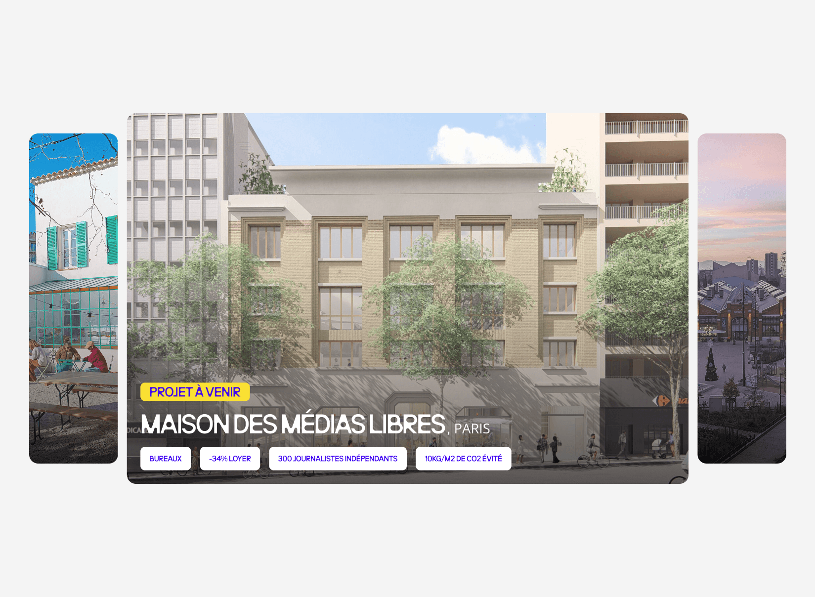
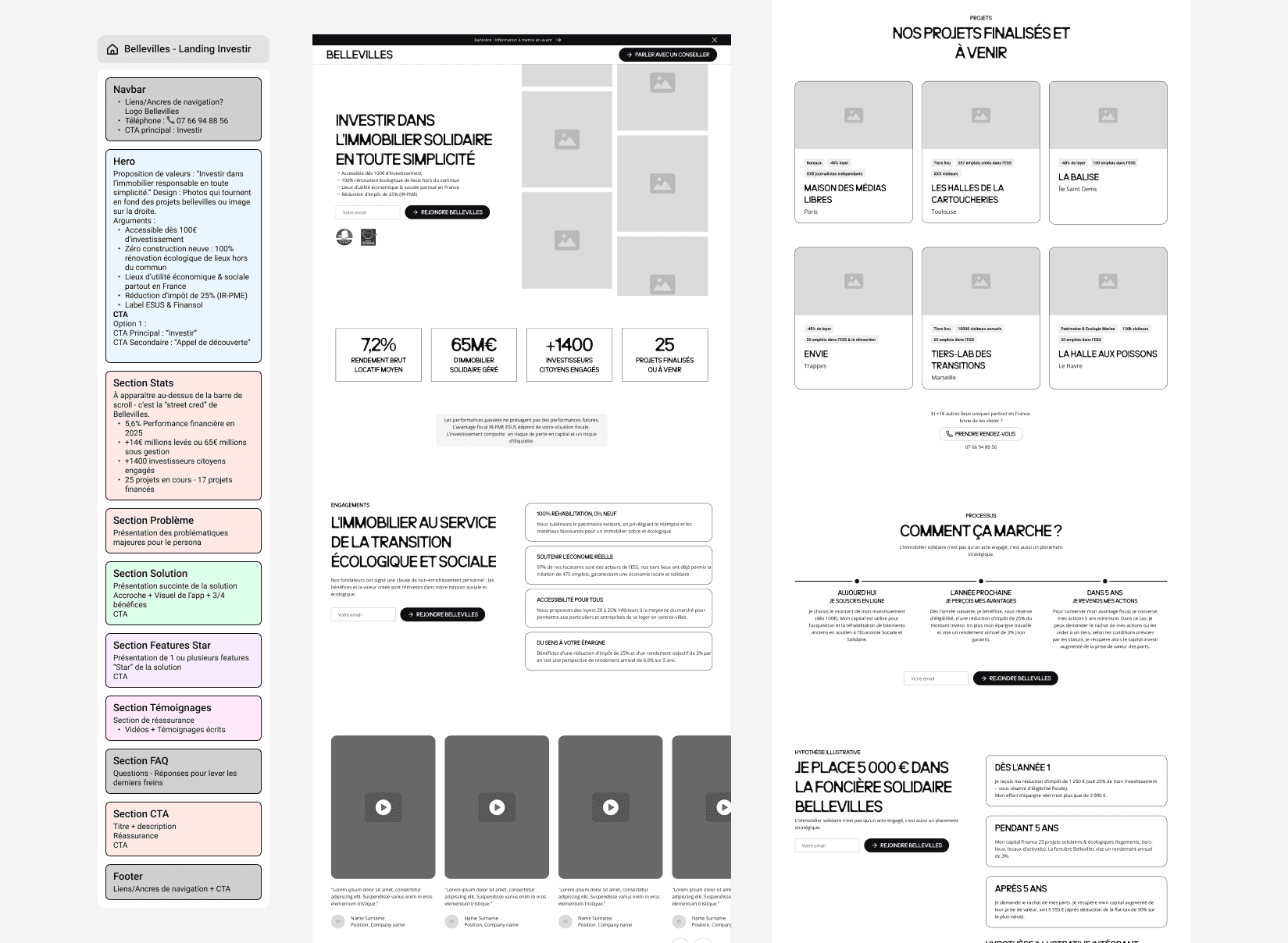
Bold editorial hero with immersive project photography: a full-bleed visual of real Bellevilles projects and key stats surfaced directly on the image establishing credibility before the first scroll
Sticky email capture throughout the page: the "Rejoindre Bellevilles" CTA follows the user down the entire page, eliminating dead zones where conversion intent has no outlet
Stacked scrolling commitment cards: the Engagements section uses a layered sticky-card system in alternating brand colors that stack on scroll, making each commitment feel like a deliberate reveal rather than a list
Concrete 5-year simulation: the investment section uses the same sticky-card mechanic to walk through "Année 1, Pendant 5 ans, and Après 5 ans" as progressive reveals
Project carousel with real impact tags: each project card surfaces specific figures as white pill tags directly over photography, making impact tangible.
Humanized CTA section: the closing section features a photo of Salambô (the investor relations contact) with a direct "Prendre rendez-vous" button, shifting the final conversion moment from transactional to personal
Brand consistency: energic blue, yellow, and warm white throughout, with Neue Brücke uppercase headings for all section titles creating a strong, editorial visual identity
The new page will serve as the conversion baseline for all future Bellevilles acquisition campaigns.